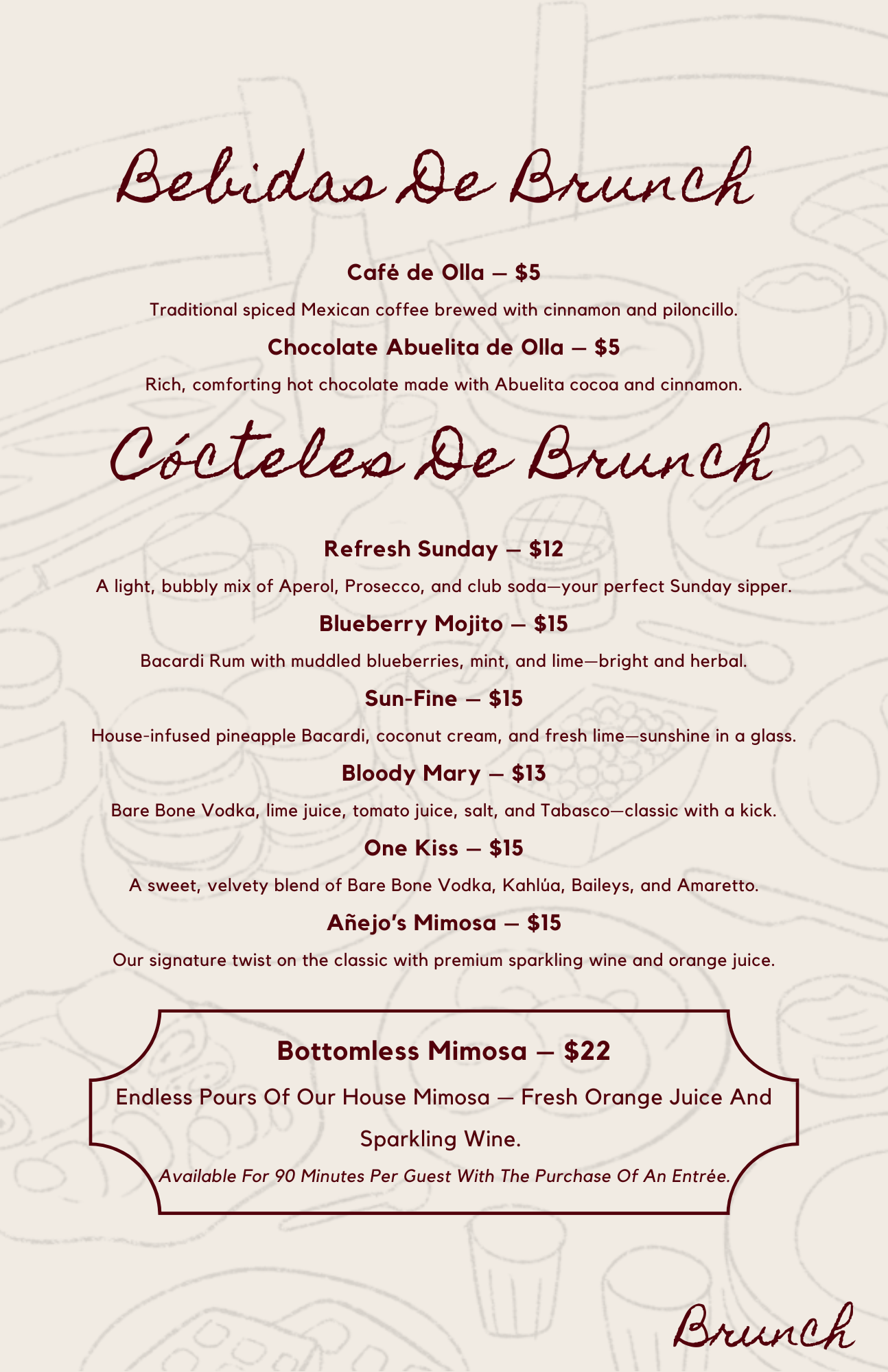
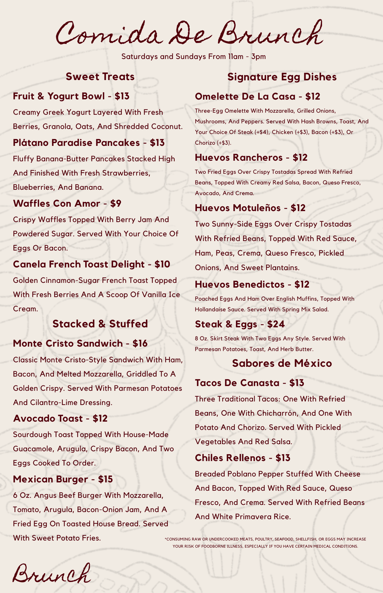
Project 02 // The Añejo Menu Redesign
CONCEPT ID: R&D // 002
AESTHETIC: Dark Elegance / High-Contrast Editorial Modernism
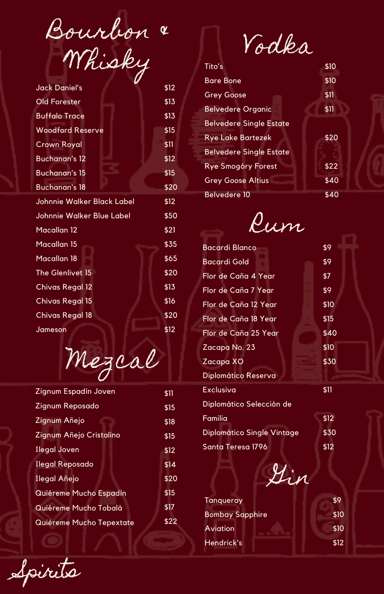
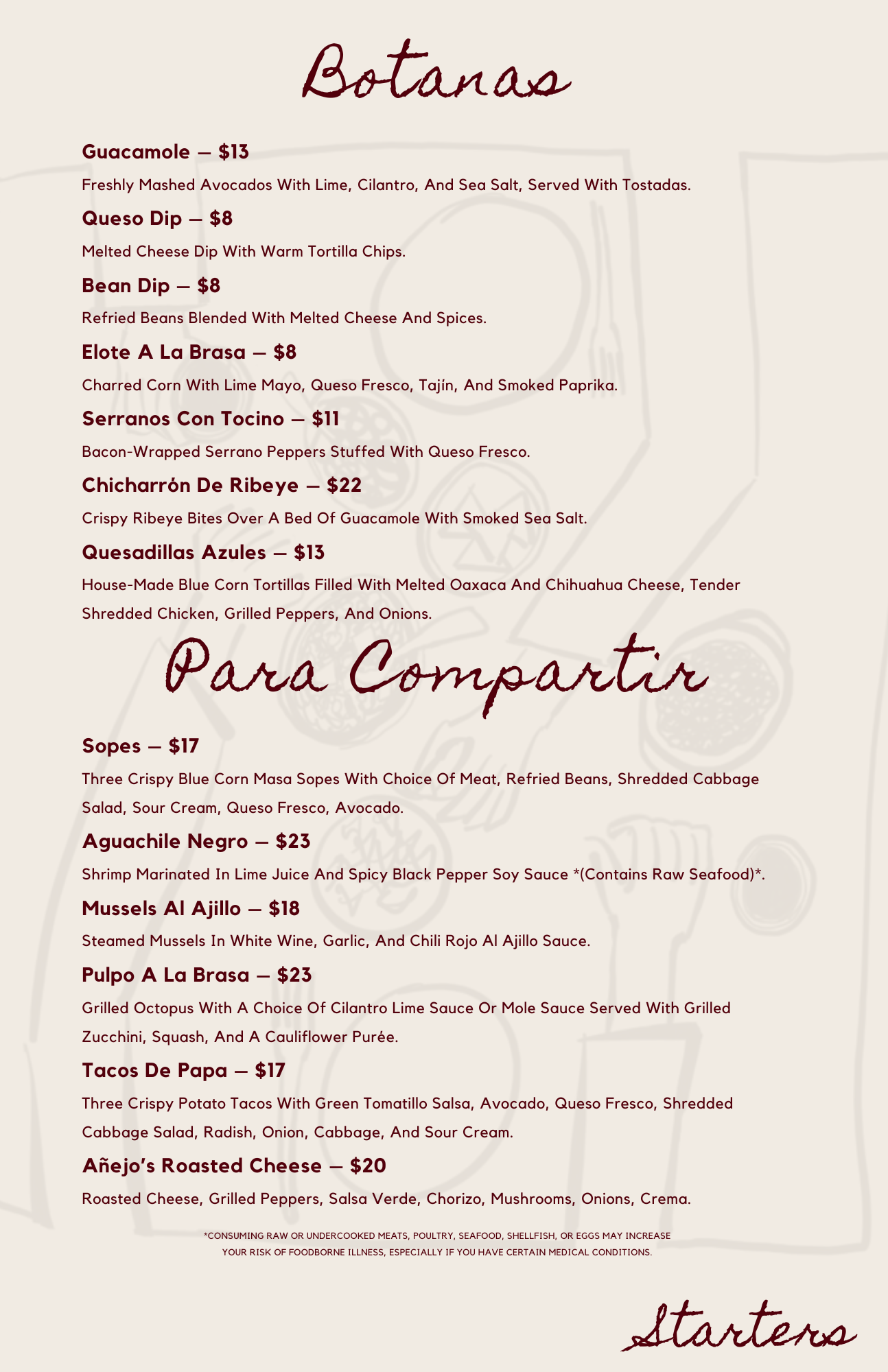
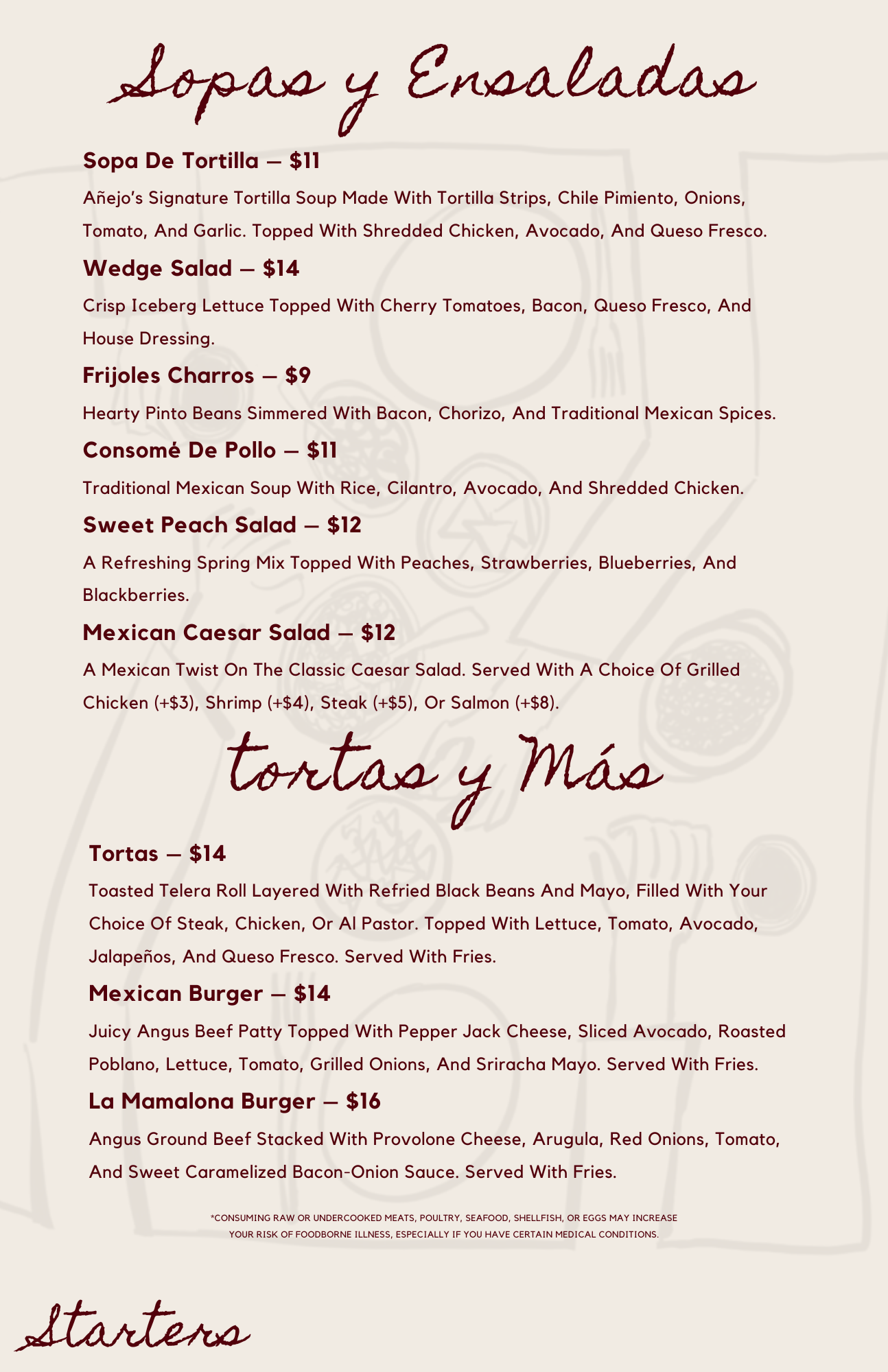
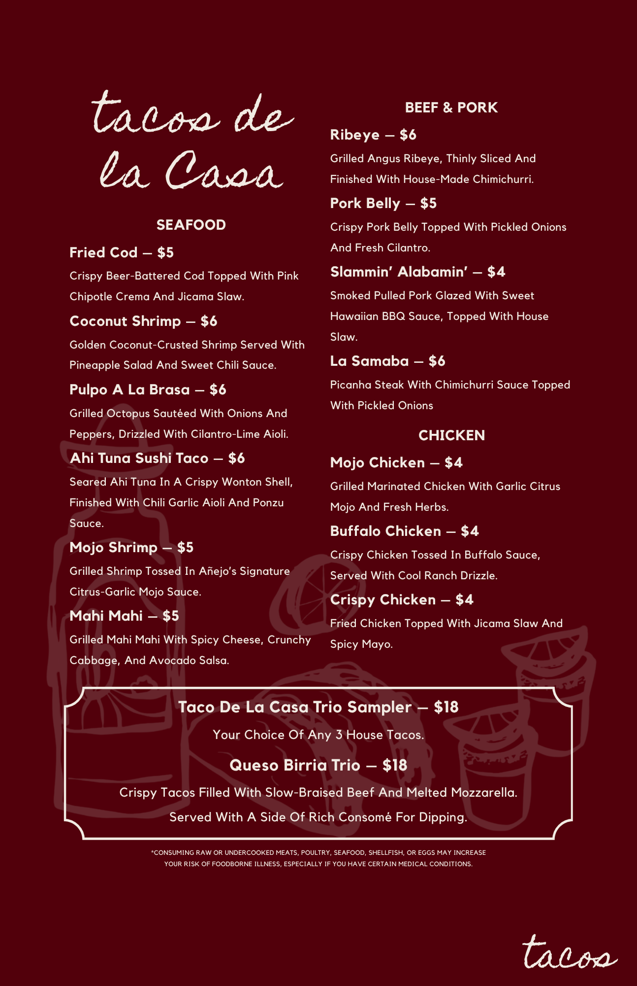
HYPOTHESIS: Transitioning hospitality menus from generic digital templates to intentional, physical art pieces deepens brand authority and shifts customer attention toward high-margin house specialties.
01 // THE Creative Spark
Aligning Space and Asset > While Añejo serves elite, premium culinary dishes in a highly designed physical environment, standard hospitality platform templates often dilute that luxury feel with plain text and flat layouts. We initiated this internal R&D project to bridge that brand gap—proving that a restaurant's physical menu should feel like an extension of its interior architecture.
02 // THE Strategy
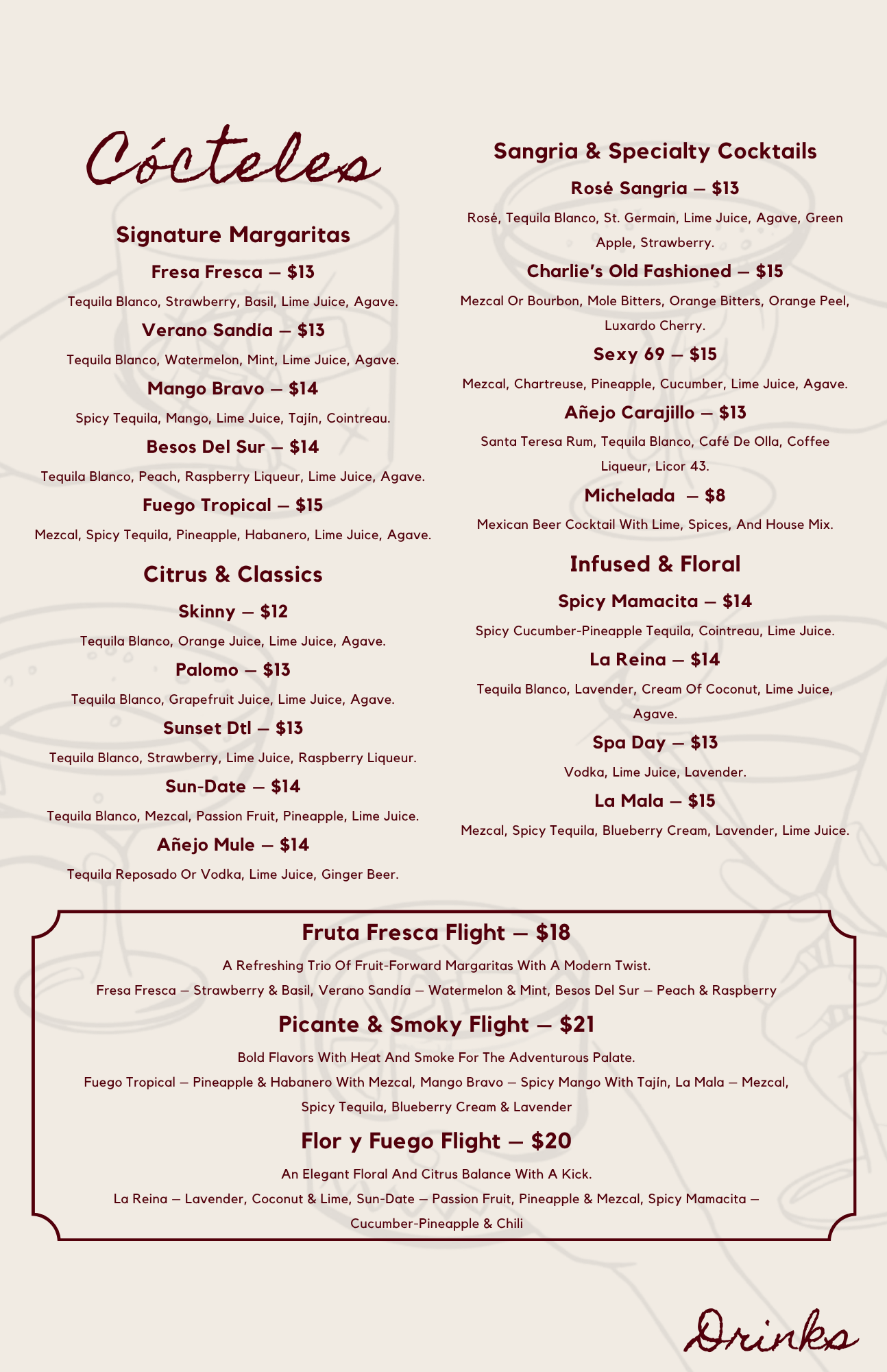
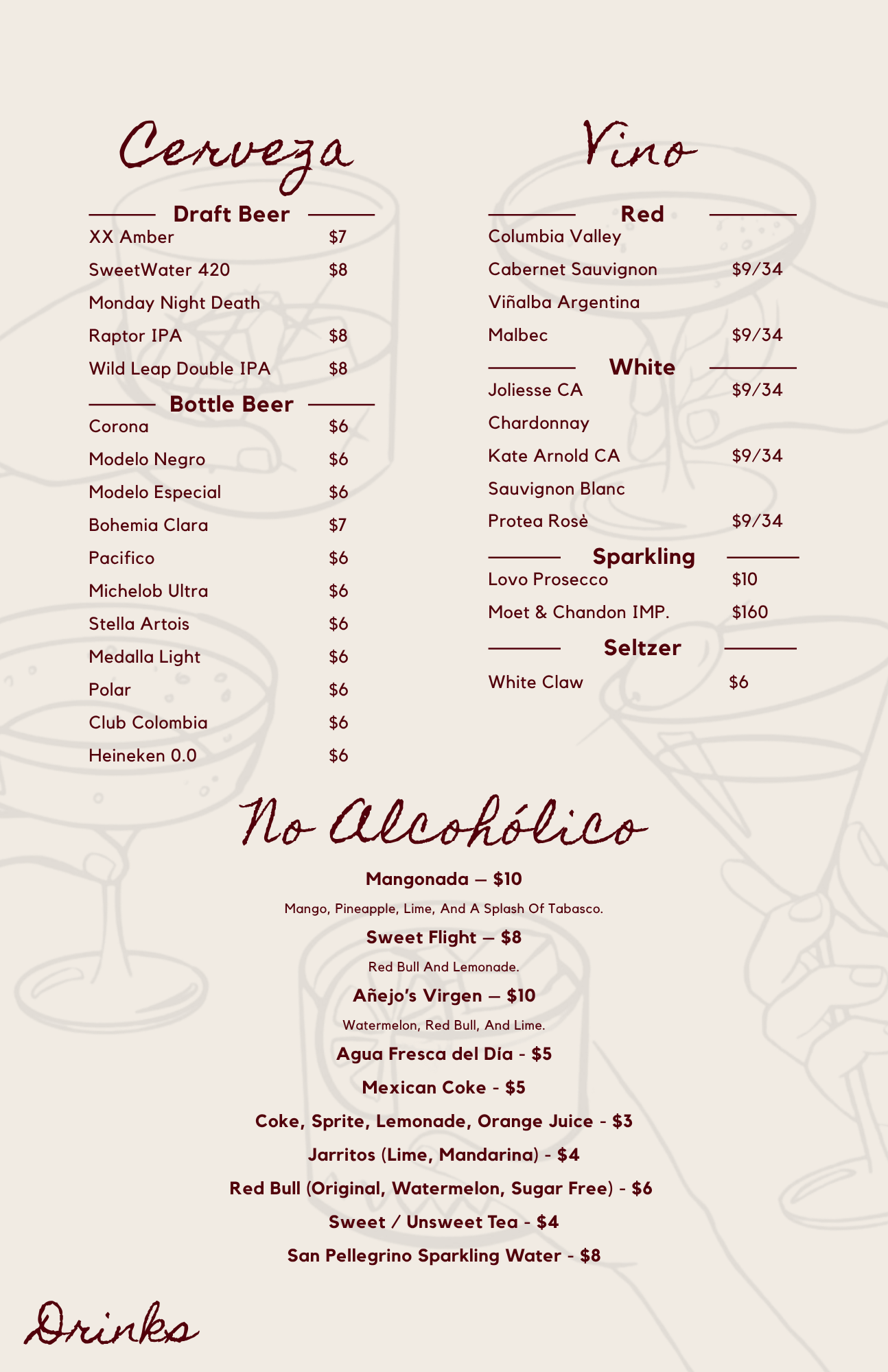
De-Cluttering for Higher Conversions > Standard text-heavy menus create cognitive fatigue for dining guests, causing them to default to basic, low-margin orders. Our redesign systematically cut out visual clutter and structured asymmetric grid layouts to isolate and elevate specific house specials and premium signature cocktails, naturally drawing the eye to high-value items first.
03 // THE Prototype
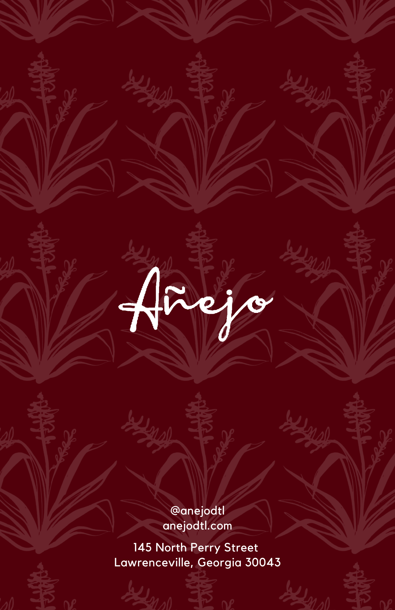
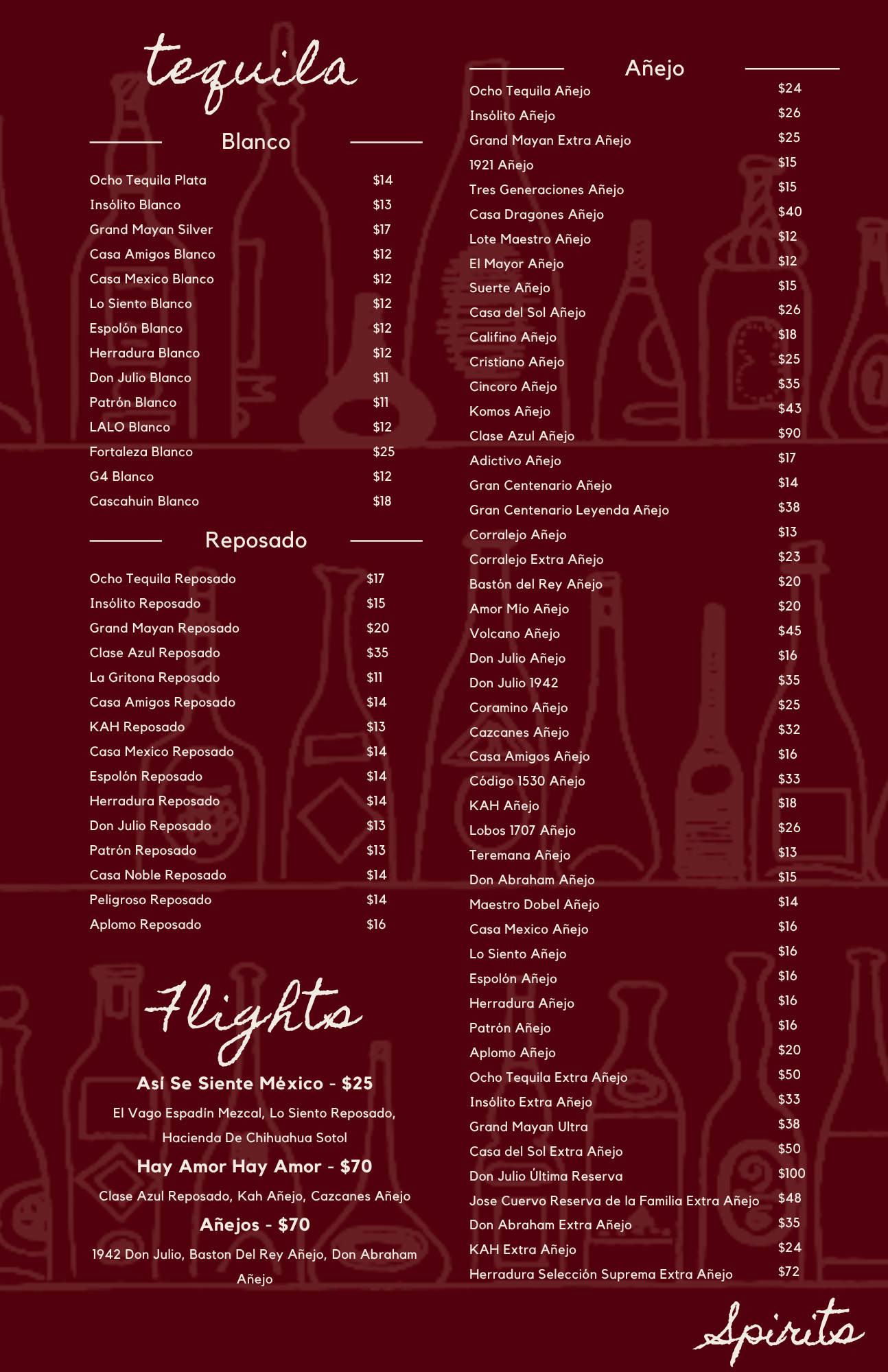
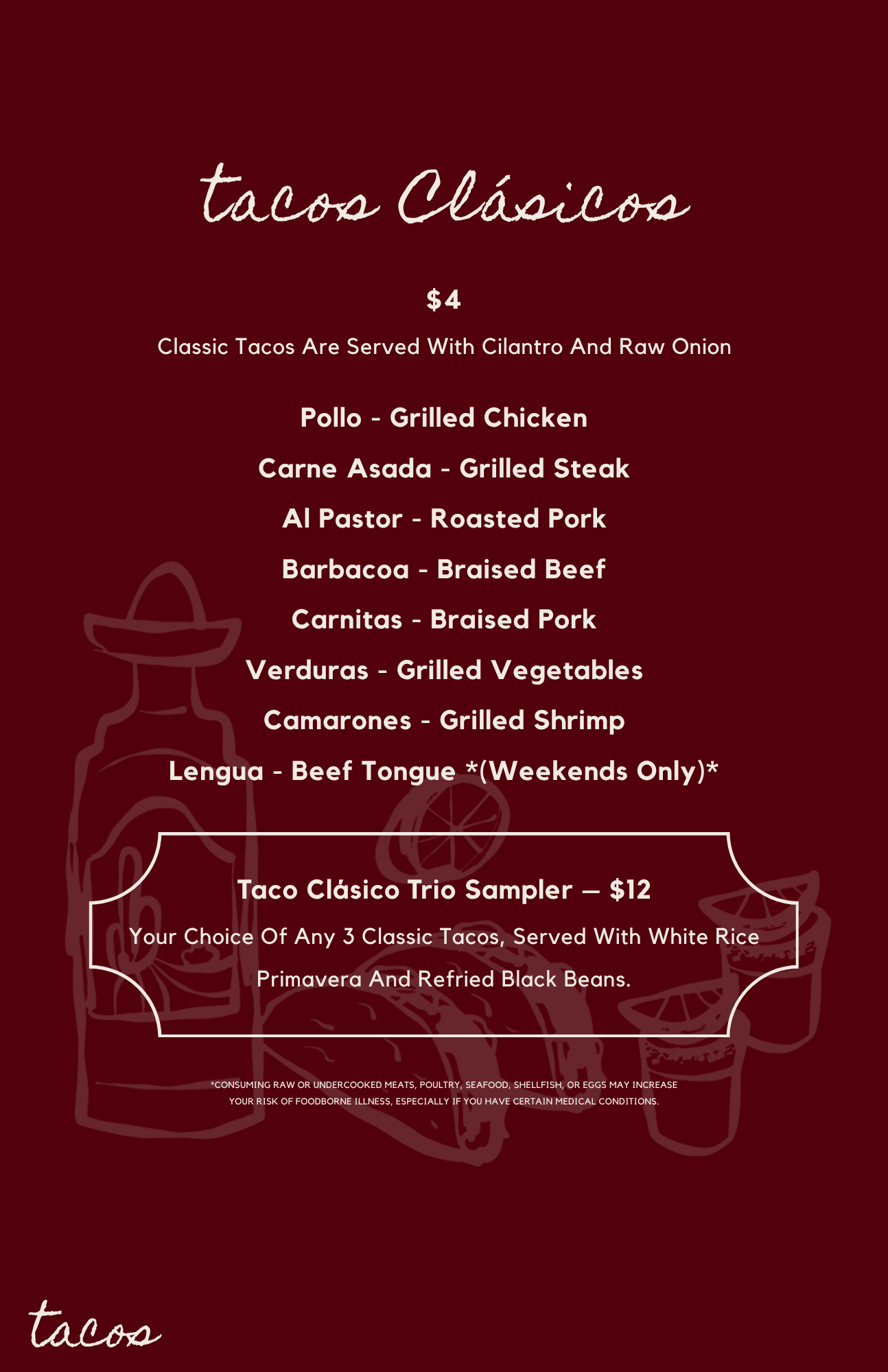
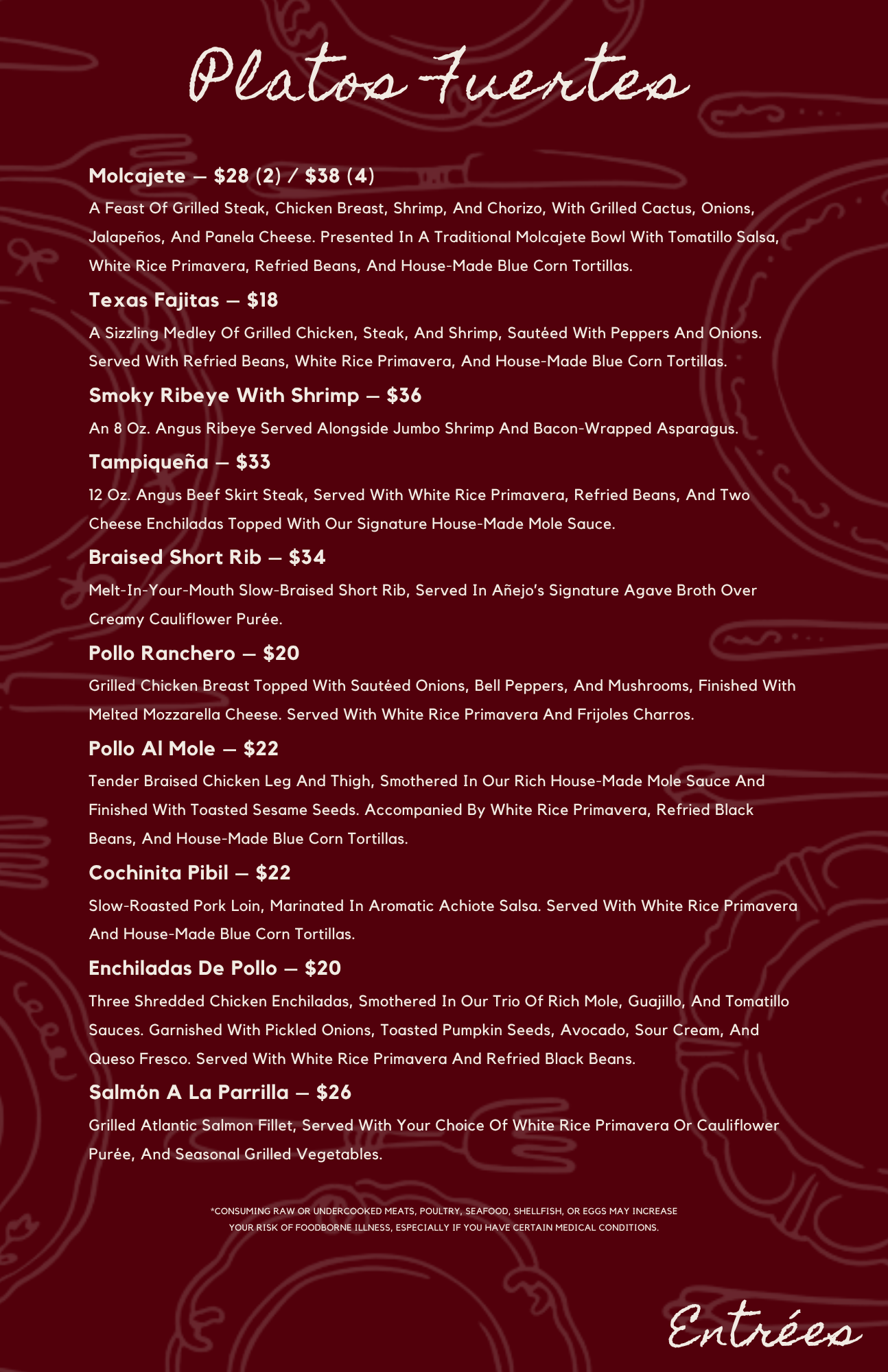
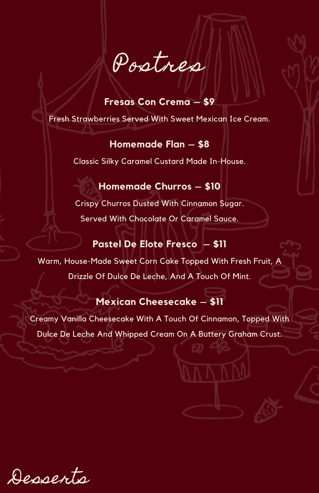
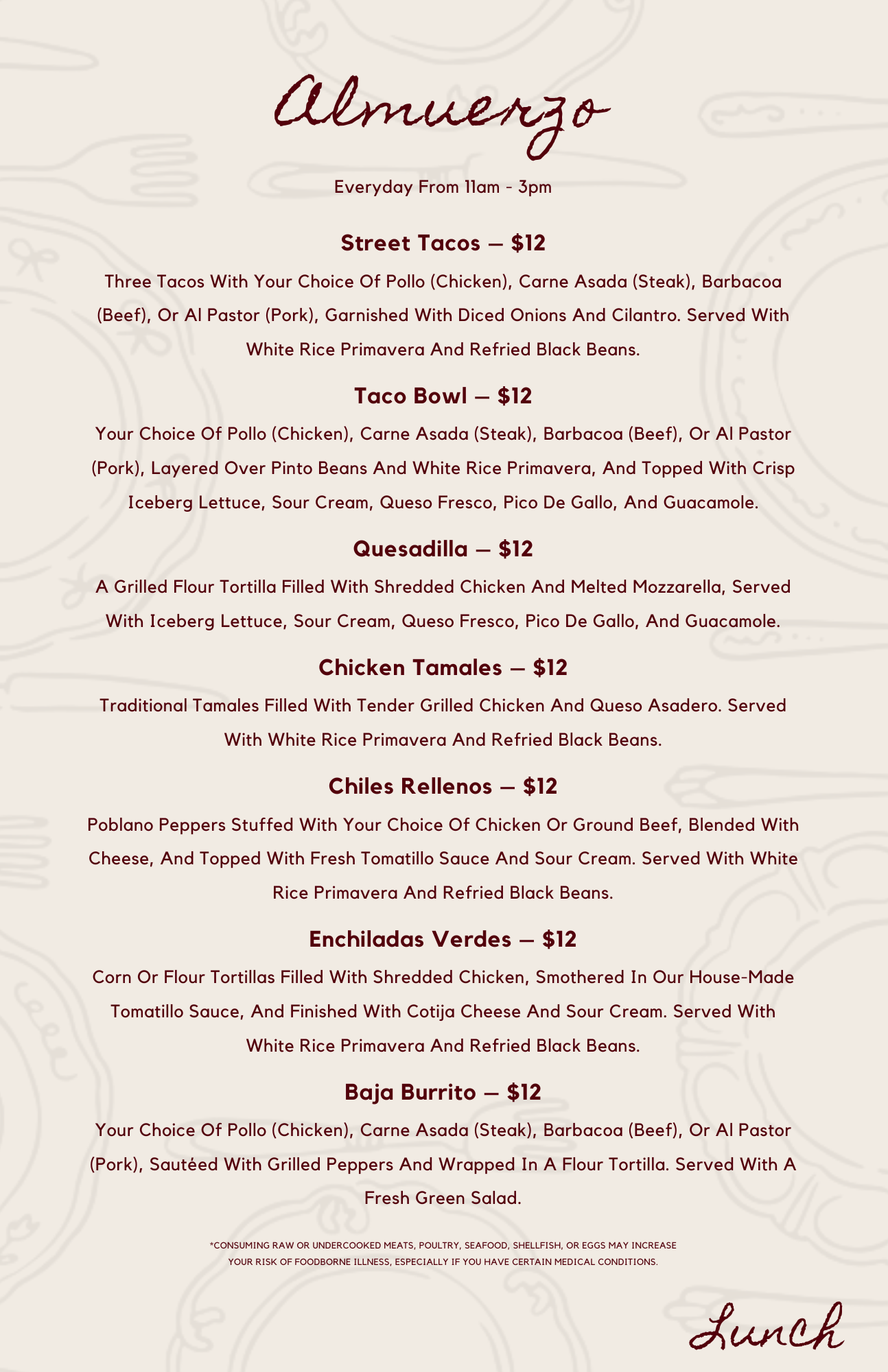
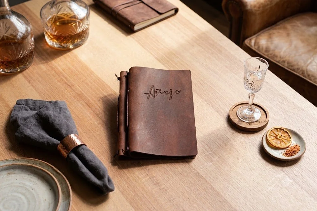
The Tactile Execution > We built and developed a premium, dark, and moody physical menu mockup to showcase the concept in context:
Deployed an upscale, high-contrast dark color palette optimized for low-light restaurant environments.
Utilized clean, sophisticated editorial serif typography to signal a luxury, curated dining experience.
Formatted the layout as a premium physical mockup, setting a highly scalable design system that the restaurant can update seasonally.